
Color Palette in Baroque Painting and the Emotional Impact of Master Artists
Standing before a Baroque masterpiece, you feel something stir deep within your chest-a rush of emotion that seems to pour directly from the canvas into your soul. This isn’t accidental magic; it’s the calculated genius of artists who understood that color could be their most powerful weapon in the battle for human hearts and minds.
The Baroque period, spanning roughly from 1600 to 1750, represented a seismic shift in how artists approached their craft. Where Renaissance painters sought harmony and balance, Baroque masters craved drama, movement, and raw emotional intensity. They discovered that certain combinations of pigments could make viewers weep, gasp, or fall to their knees in spiritual ecstasy.
This exploration reveals how these artistic revolutionaries weaponized their palettes, turning simple mixtures of ground minerals and oils into tools of profound psychological manipulation that continue to captivate audiences more than four centuries later.
Understanding Baroque Art Movement
The Baroque movement emerged from the Catholic Counter-Reformation’s desire to reconnect with worshippers through art that spoke directly to their emotions rather than their intellect. Unlike their Renaissance predecessors who celebrated mathematical precision and classical restraint, Baroque artists embraced theatricality, creating works that seemed to burst beyond their frames with life and energy.
This artistic revolution coincided with major scientific discoveries about light, optics, and human anatomy. Artists gained unprecedented understanding of how shadows fell across three-dimensional forms and how the human eye processed visual information. They used this knowledge to create paintings that felt more real than reality itself.
The movement’s emphasis on dramatic storytelling meant that every artistic choice-from composition to brushstroke-served the greater goal of emotional engagement. Color became the primary vehicle for this mission, with artists developing sophisticated theories about how different hues could trigger specific psychological responses in viewers.
The Psychology of Color in Visual Arts
Modern neuroscience confirms what Baroque masters understood intuitively: color directly impacts human emotion through complex neurological pathways. When light wavelengths hit our retinas, they trigger not just visual processing but also activate regions of the brain associated with memory, mood, and physiological arousal.
Baroque painters recognized that warm colors like deep reds and golden yellows could accelerate heart rates and create feelings of passion or urgency, while cooler blues and greens promoted contemplation and spiritual reflection. They exploited these responses ruthlessly, using color temperature shifts to guide viewers’ emotional journeys through their narratives.
Primary emotional associations in Baroque color theory:
- Deep crimson and scarlet: Divine love, martyrdom, passion
- Rich gold and amber: Heavenly light, spiritual enlightenment
- Ultramarine blue: Purity, contemplation, infinite space
- Burnt sienna and umber: Earthly mortality, human suffering
- Ivory and pearl white: Innocence, resurrection, divine grace
Signature Color Techniques of Baroque Masters
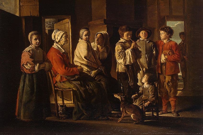
Chiaroscuro, the dramatic interplay between light and shadow, became the defining technique of Baroque painting. Artists didn’t simply illuminate their subjects; they sculpted them with light, using stark contrasts to create three-dimensional forms that seemed to emerge from darkness itself. This technique relied heavily on a restricted palette of earth tones punctuated by strategic highlights.
The dominance of rich, warm earth tones in Baroque painting served multiple purposes beyond mere aesthetic appeal. Burnt umber, raw sienna, and ochre created a sense of temporal weight and gravitas that made religious and mythological subjects feel immediate and relevant to contemporary viewers. These colors also aged beautifully, developing deeper resonance over time.
Religious works particularly favored combinations of gold and deep crimson, colors that carried centuries of symbolic meaning in Christian iconography. Gold represented divine presence and eternal light, while crimson symbolized both Christ’s sacrifice and divine love. When used together, they created visual experiences that felt simultaneously earthly and transcendent.
The revolutionary aspect of Baroque color application lay in how artists built up layers of transparent glazes to achieve luminous depth. Unlike earlier techniques that relied on opaque color mixing, Baroque masters understood that light could be trapped between thin layers of paint, creating an inner glow that made their subjects appear lit from within by spiritual fire.
Master Artists and Their Distinctive Palettes
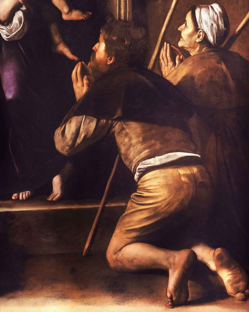
Caravaggio revolutionized painting by developing a palette dominated by deep browns and blacks punctuated by dramatic highlights in warm flesh tones and brilliant whites. His technique of tenebrism-extreme contrasts between light and dark-created paintings that felt like theatrical spotlights illuminating crucial moments in biblical narratives. His color choices weren’t decorative; they were storytelling tools that focused viewers’ attention with laser precision.
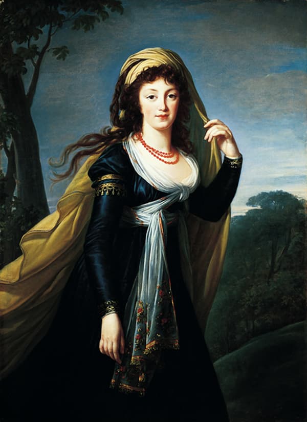
Peter Paul Rubens approached color with the exuberance of someone who truly loved the sensual properties of paint itself. His palette celebrated warm, flesh-toned hues that made his subjects appear vibrantly alive. Rubens layered translucent pinks over warm underpainting to create skin that seemed to pulse with blood and breath. His mastery of color temperature allowed him to paint convincing candlelight, sunrise, and the subtle variations in human complexion.
Rembrandt’s genius lay in his understanding of how golden-brown atmospheric effects could create psychological intimacy between viewers and subjects. His later works abandoned bright colors almost entirely, focusing instead on subtle variations within a narrow range of earth tones. This restraint paradoxically made his paintings more emotionally powerful, as every slight shift in color carried enormous expressive weight.
Emotional Storytelling Through Color Choices
Baroque artists understood that color could function as a narrative language, guiding viewers through complex stories without relying on obvious symbols or text. They developed sophisticated color coding systems where specific hues carried consistent meanings across different works, creating a visual vocabulary that educated viewers could read like literature.
The strategic placement of color accents within otherwise muted compositions directed attention to crucial narrative elements. A flash of red fabric might indicate impending violence, while a beam of golden light could signal divine intervention. These color choices weren’t arbitrary decorations but carefully planned emotional cues that enhanced storytelling effectiveness.
Five essential color-emotion techniques perfected by Baroque artists:
- Color temperature progression – Moving from warm to cool tones to suggest temporal or spiritual transitions
- Selective saturation – Using one highly saturated color against muted surroundings for maximum impact
- Complementary contrast – Placing opposite colors adjacent to create visual tension and emotional drama
- Atmospheric perspective – Cooling and dulling distant colors to create convincing spatial depth
- Symbolic color coding – Consistently associating specific hues with particular emotional or spiritual concepts
Regional Variations in Baroque Color Traditions
Italian Baroque painting embraced bold, theatrical color schemes that reflected the movement’s origins in Counter-Reformation religious art. Artists like Bernini and Borromini created works that practically shouted their spiritual messages through intense combinations of gold, crimson, and deep blue. The Italian approach prioritized immediate emotional impact over subtle psychological manipulation.
Dutch Golden Age painters developed a more restrained approach to Baroque color theory, influenced by Protestant religious sensibilities and the practical needs of portraiture and genre painting. Artists like Vermeer and de Hooch mastered subtle color harmonies that created intimate, contemplative moods. Their palettes featured cooler temperatures and softer contrasts, reflecting different cultural values about appropriate emotional expression.
Spanish Baroque artists combined Italian dramatic intensity with distinctly Iberian spiritual mysticism, creating color palettes that conveyed religious ecstasy and suffering with equal power. El Greco’s elongated figures glowed with supernatural colors, while Zurbarán’s still lifes transformed everyday objects into religious symbols through careful color manipulation.
Modern Applications of Baroque Color Principles
Contemporary artists continue drawing inspiration from Baroque color mastery, though they apply these techniques to secular subjects and modern themes. Painters like Lucian Freud and Jenny Saville use Baroque flesh tone techniques to create psychologically intense portraits, while cinematographers study Caravaggio’s lighting methods to enhance dramatic scenes in films.
The advertising and fashion industries have also embraced Baroque color psychology, using dramatic contrasts and warm/cool temperature shifts to create compelling visual narratives. Understanding how these historical masters manipulated color for emotional effect provides valuable insights for anyone working in visual communication fields.
Final Reflections
The Baroque masters’ revolutionary approach to color psychology created a visual language that transcends cultural and temporal boundaries. Their understanding that color could directly access human emotion without requiring intellectual mediation established principles that remain relevant for contemporary artists, designers, and anyone seeking to create meaningful visual experiences.
These artistic pioneers proved that technical mastery combined with deep psychological insight could transform simple pigments into tools of profound human connection. Their legacy reminds us that great art doesn’t just please the eye-it reaches directly into the viewer’s soul, creating experiences that linger long after we’ve walked away from the canvas.